Web writing that doesn’t suck
Text forms the backbone of most websites, so it’s crucial to structure it properly. Paragraph length, word choice, and simple vocabulary make up about 70% of effective, high-quality content. Following a few simple rules will help make your content more readable.
- Ensure proper grammar. This is the minimum, yet often overlooked. Always proofread, even if the text comes from a copywriter.
- Check language clarity. Match your words to your audience.
- Avoid repeating sentence starters. It confuses readers and becomes annoying.
- Keep paragraphs short. Each one should cover a single idea. More short paragraphs improve flow.
- Avoid overly long sentences. Stick to about 50–60 characters to keep the thread clear.
- Use bullet points. They help structure your message visually.
Fonts are the voice of your text
Think of fonts as giving your words a tone. Before browsing endless font libraries, consider the feeling you want your message to convey. A well-matched font supports the impression you aim to make.
Fonts are generally grouped into two categories: serif and sans-serif. Less common are handwritten and monospace styles.
- Serif fonts have decorative strokes (“serifs”) that once helped guide reading. On screens, they’re now mostly used for style.
- Sans-serif fonts lack those strokes, making them more common in visual design.
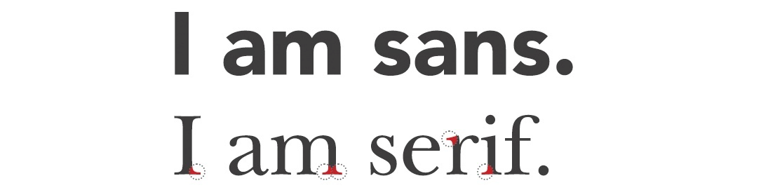 Visual contrast between serif and sans-serif typefaces
Serif fonts are often used on more serious or text-heavy sites. Sans-serif fonts are ideal when visual clarity is key. Today, it’s common to mix both types. A Wikipedia article (a bit dated but useful) compares their applications.
Font type, size, and color
Most websites use two or three typefaces:
- One for headings
- One for body text
- One optional for decorative purposes
In many cases, just two fonts are enough—often pairing sans-serif for headings with serif for paragraphs (or vice versa).
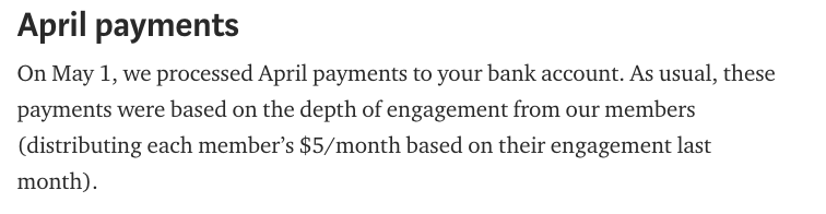 Example of serif font for body text and sans-serif font for headings, as seen on Medium.com.
You can explore your own combinations, but I suggest using curated font pairings. Great resources include FontPair and Canva Font Combinations.
Beginners often misuse font sizes, leading to a chaotic visual hierarchy. Oversized headings distract; undersized ones blend in.
The default browser font size is 16px (1em)—a solid base for readability across screens. TypeCast offers a reliable size scale for desktop and mobile.
Choose font color based on contrast with the background. WCAG 2.0 guidelines recommend:
- 4.5:1 contrast for regular text
- 3:1 for bold text
You can test your colors here.
How users read digital content
Most users don’t read website content fully—they scan it for what they need. There are common scanning patterns, influenced by the user’s motivation.
In a 2006 study by Nielsen Norman Group, people first scan left to right, then vertically down the left. This is called the F-pattern.
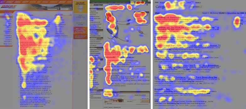 Heatmap illustrating F-pattern reading behavior
Today, the F-pattern is considered problematic. Kara Pernice from the same group notes in F-Shaped Pattern of Reading on the Web:
When users scan in an F shape, they skip large parts of text just based on layout. Skipped words are often just as important as the ones they read—they just don’t realize what they’re missing.
She also outlines other scan patterns:
- Layer-cake pattern – users read only headings. The heatmap looks like layered cake.
- Spotted pattern – skipping text while looking for specific elements like links, numbers, or keywords.
- Marking pattern – keeping eyes in one spot while scrolling, more common on phones.
- Bypassing pattern – skipping the first words of lines when several lines start the same.
- Commitment pattern – highly engaged users read full paragraphs or the whole page.
To see how users navigate your content, generate a heatmap.
True heatmaps are made with eye-trackers during user testing. Online tools like Hotjar use mouse movement instead, which is less precise but still insightful.
Clear layout – the antidote to careless scanning
A layout is a consistent visual structure defining page sections like headers, content columns, and footers. Good layout makes websites easier to explore thanks to learned visual patterns.
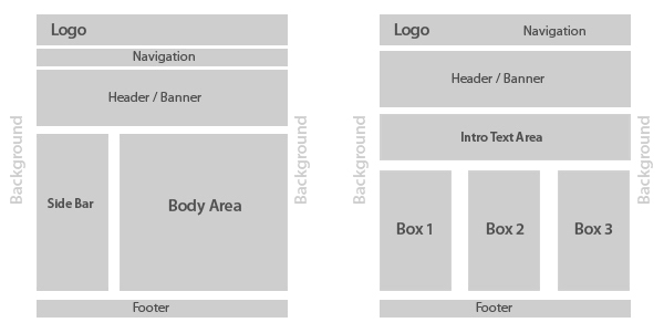 Illustration of a typical website layout
A solid layout places text inside a fixed-width container, which is much easier to read than text stretched across the full screen.
Ideally, the text column should occupy about 70% of page width