Icon or label?
When it comes to designing more complex interfaces, a common challenge often arises:
If I place an icon here, will users understand what it does? Maybe adding a label would make it clearer?
There’s no single answer—it depends on the project’s assumptions, such as the target device or specific user group. Still, there are good practices we can follow when designing either form.
The first issue with using icons alone is fairly predictable: we can’t control how end-users interpret the meaning of a given symbol. According to the fourth stage of visual perception, the same symbol can convey entirely different meanings depending on language, culture, or context. Before assigning an icon to a specific action, we should ensure it doesn’t carry multiple interpretations.
Icons also place a greater demand on our working memory. It takes more time to visually scan a shape and match it with a known meaning or function. A navigation system made up of dozens of custom icons can be confusing at first and somewhat overwhelming for new users.
 Android navigation buttons
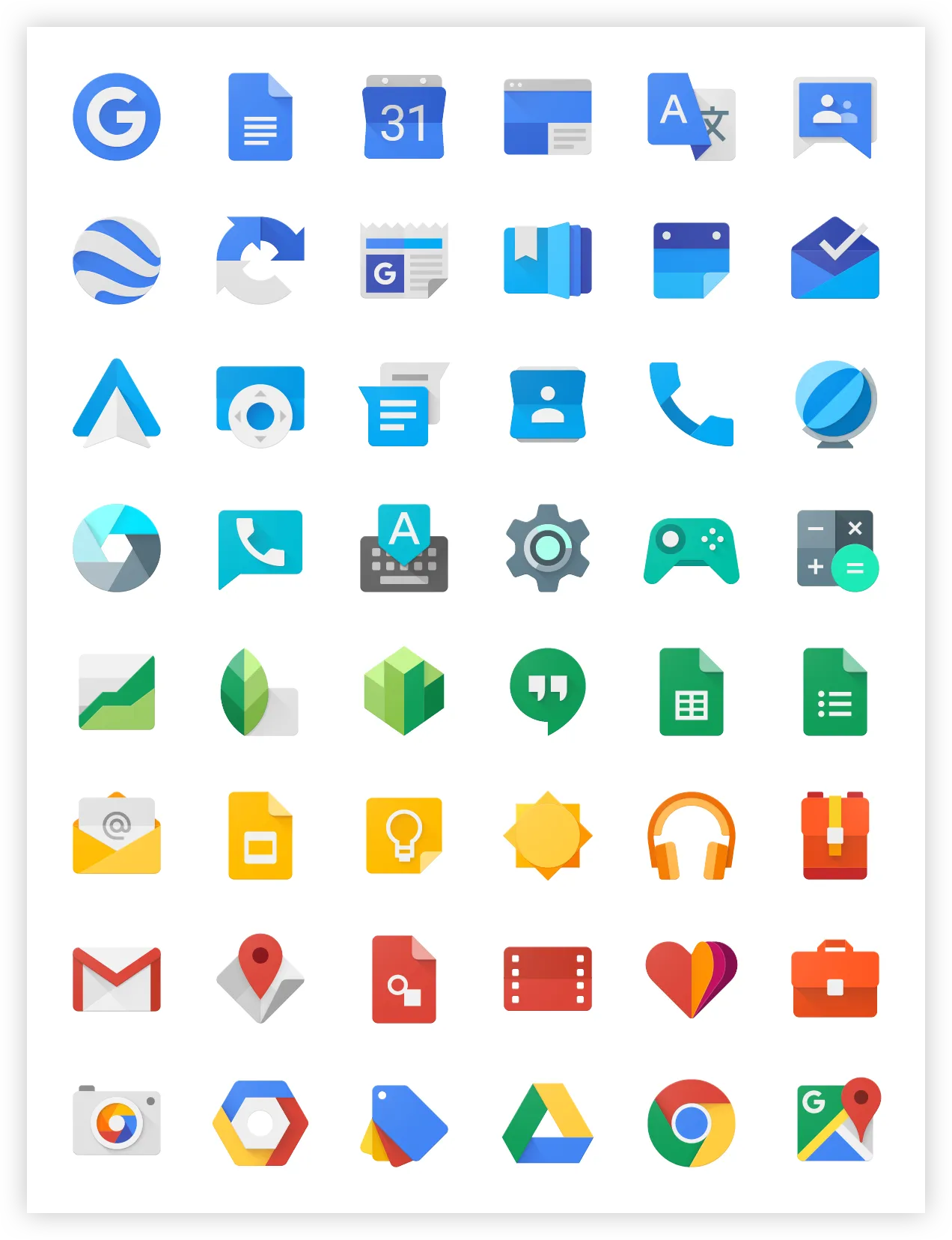 Material UI Icons
“A picture is worth a thousand words.”
The turning point comes when users start to remember what each icon means through repeated use of the product. Over time, they build mental connections between interface elements—forming a kind of “mind map.”
We can speed up this process by introducing a consistent design language and assigning unique icons to primary actions. A well-defined design language helps users recognize shapes and visual cues that are consistently associated with specific meanings.
When icons are uniquely tied to specific functions, navigation becomes faster and more intuitive.
Following these principles can turn icon-based navigation into an efficient and space-saving tool.
“One day I will find the right words, and they will be simple.”
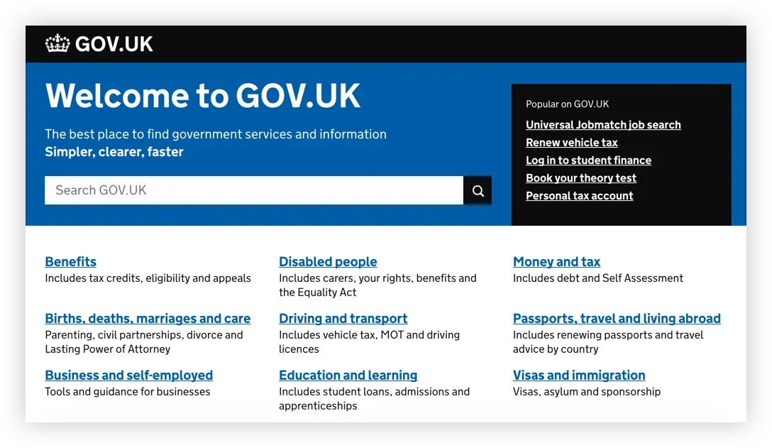 GOV.UK Navigation
Designing effective text labels can be just as challenging as choosing the right icons. Even if a label seems brief and clear to you, it might still be ambiguous to parts of your audience. If you have the budget, you can use professional research methods like card sorting. However, here are a few good practices you can apply right away:
-
Narrow the scope
Reduce the number of possible interpretations. After placing the label in context, double-check that its meaning is clear and unambiguous. -
Avoid over-explaining
A label isn’t a paragraph. It should clearly and briefly indicate what it refers to—nothing more. -
Maintain consistency
Choose one grammatical structure for all labels and stick with it. Avoid mixing styles—don’t pair a verb-based label like “Charging your account” with a noun-based one like “Account charges.” -
Adjust terminology
Use language that fits your target audience. Don’t overcomplicate labels, but also don’t oversimplify if your product is meant for specialists—avoid using overly casual terms where precision matters.
Icons paired with labels
Adding labels to existing icons can enhance clarity and serve as a helpful backup—especially when the icon’s meaning isn’t immediately obvious.
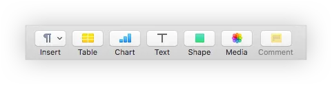 Toolbar in Pages ( macOS text editor )
This combination of icon and label can serve two primary purposes: decoration or navigation. When using icons for navigation, if an icon feels too ambiguous, consider revisiting the original design assumptions. Validate whether the icon aligns with your established visual language before simply adding a label as a fix.
Keep in mind that if every icon requires a label to be understood, it may undermine the purpose of using icons in the first place. Over-reliance on labels could increase interface complexity rather than reduce it.
Tooltip: the best solution?
Tooltips are a well-known interface pattern. They allow users to explore icons with short explanations that appear on hover. While this works well on desktops, it fails on touchscreens, which don’t support hover states—limiting its use on mobile.
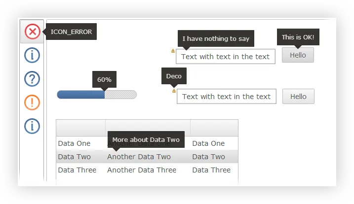 Tooltips are a well-known interface pattern.
Conclusion
Iconic labels work well as shortcuts for primary actions and status indicators. We can teach users our visual system, helping them move faster while saving space.
Text labels are useful for clarity, especially when dealing with lots of forms or content—but overusing them may slow users down by forcing them to read everything.
Combining icons and labels often gives us the best of both worlds. If you don’t have a loyal or returning user base—or simply want a more accessible interface—this hybrid approach may be your best bet.