Creating consistent UI Components with Angular 2 and transclusion
If you’re a front-end developer or designer experimenting with Angular, you might have run into some of the following issues while building a UI:
- CSS classes getting out of control and HTML turning messy
- Struggling to clean up or restructure bloated CSS
- Feeling overwhelmed by naming conventions like BEM
If any of this sounds familiar, I have a few tips to help you create a more consistent and maintainable UI using Angular 2—and more specifically, transclusion.
Don’t be intimidated by the term transclusion. It’s simpler than it sounds. To paraphrase Scotch.io:
Transclusion lets you define a fixed template for a UI element while allowing dynamic content to be injected into predefined slots.
In short, you can build reusable UI components—like a card or a panel—and easily slot in different content. Let’s break this down.
How transclusion works and why components are the key
Angular 2 introduces the concept of components—self-contained elements that use custom HTML selectors. They let you scope your CSS without worrying about leaking styles or creating tangled, hard-to-maintain code.
This isolation is the foundation for building clean, modular UIs.
To use transclusion in Angular 2, you use the <ng-content> tag inside your component’s HTML. This defines where dynamic content can be placed.
You can even use the select attribute to target specific slots—more on that in a second.
Building a panel pomponent
Let’s walk through a simple example: a reusable Panel component with a header and content area.
Step 1: Create the component (panel.ts)
//
// panel.ts
//
import {Component} from 'angular2/core';

@Component({
selector: 'panel',
template: `
      <div class="panel">
        <div class="panel-header">
          <ng-content select="panel-header"></ng-content>
        </div>
        <ng-content></ng-content>
      </div>
  `
})
export class PanelComponent {}
We use the select attribute to define where specific content will be injected.
<ng-content select="panel-header"></ng-content>`
Note: To make custom tags like <panel-header> work, you’ll need to include this in your app module:
schemas: [ CUSTOM_ELEMENTS_SCHEMA ]
Otherwise, Angular will throw a template error.
Step 2: Add component styles (panel.sass)
//
// panel.sass
//
.panel
  background-color: #fff
  border: 1px solid transparent
  border-radius: 4px
  -webkit-box-shadow: 0 1px 1px rgba(0,0,0,.05)
  box-shadow: 0 1px 1px rgba(0,0,0,.05)
  color: #333

  .panel-header
    padding: 10px 15px
    border-bottom: 1px solid transparent
    border-top-left-radius: 3px
    border-top-right-radius: 3px
    background-color: #f5f5f5
    border-color: #ddd
Style your panel component and import the stylesheet into your main SASS/SCSS file.
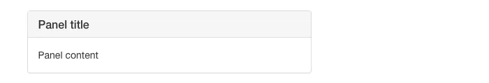
Step 3: Use your panel anywhere
<panel>
    <panel-header>
        Panel title
    </panel-header>
        Panel content
</panel>
Once set up, you can use your panel component anywhere in your application with clean, readable HTML.
Why this matters
Our Panel component has a clear, consistent structure. You can now reuse it across your project without writing CSS classes directly in your templates.
This modular approach allows you to build complex UIs from small, reusable building blocks—like LEGO. While it requires a bit of upfront planning, especially for beginners, the long-term benefits are worth it: cleaner code, better scalability, and easier maintenance.
Understanding the select Attribute in <ng-content>
In our example, we used select with an HTML tag, but Angular’s transclusion mechanism offers more flexibility. The select attribute allows you to match content not just by tag name, but also by class, attribute, or attribute value. Here’s how it works:
1. Matching by HTML Tag
<ng-content select="panel-header"></ng-content>
DOM Output:
<panel-header></panel-header>
2. Matching by CSS Class
<ng-content select=".panel-header"></ng-content>
DOM Output:
<div class="panel-header"></div>
3. Matching by Attribute
<ng-content select="[panel-header]"></ng-content>
DOM Output:
<div panel-header></div>
4. Matching by Attribute Value
<ng-content select="[panel-header='true']"></ng-content>
DOM Output:
<div panel-header="true"></div>